Investors who have logged in today to their account were pleasantly surprised by the completely New Dashboard, which clearly shows the investment statistics and updates on each project. If you haven’t seen the new CROWDESTOR dashboard yet, go check it out! In this article, we will take you through the new look of the investors’ cabinet, and will explain the logic behind each tab, so save it to your bookmarks!
Diversification Level

The Diversification Level “ruler” shows how well you are managing your risks. Each level measures how much (in %) of your total portfolio is allocated to one single project. If half or more of your invested money is allocated to a single project, this corresponds to a diversification level “1”. If no more than 2% of total portfolio is invested in one project than this corresponds to a diversification level “10”. The higher the level, the better, as underperformance of one asset is compensated by overperformance of other assets.
Diversification is a golden rule of investing and should be practiced. We have tested our hypothesis using the historical data and it confirmed that, that on average the investment yield of our clients increases, along with the diversification level. Investors whose investments corresponded to our diversification level “10” earned 28%, while investors who concentrated their portfolio on one asset, have earned on average 13%. This is a quite large spread, which speaks for itself. The calculation was based using the actual payments to the investors’ accounts, meaning it took all delays into account. Please note, this calculation was performed using the historical data and the historical data is not an indication of future returns. However, it is useful to estimate the return level you are expected to receive.
Account Balance
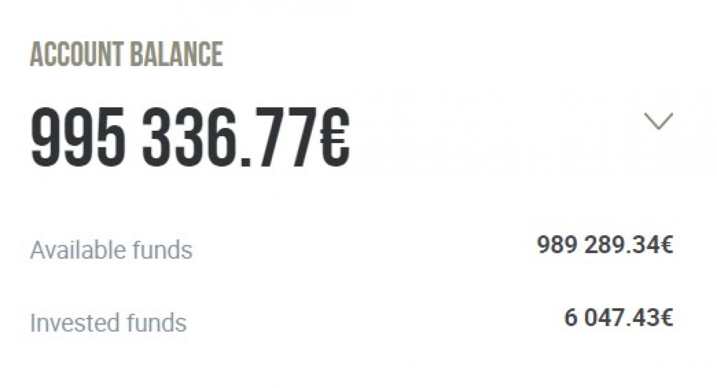
“Account Balance” shows the overall balance on your investors’ account. It includes the invested and available funds (not invested). For your convenience, you can see the breakdown underneath.
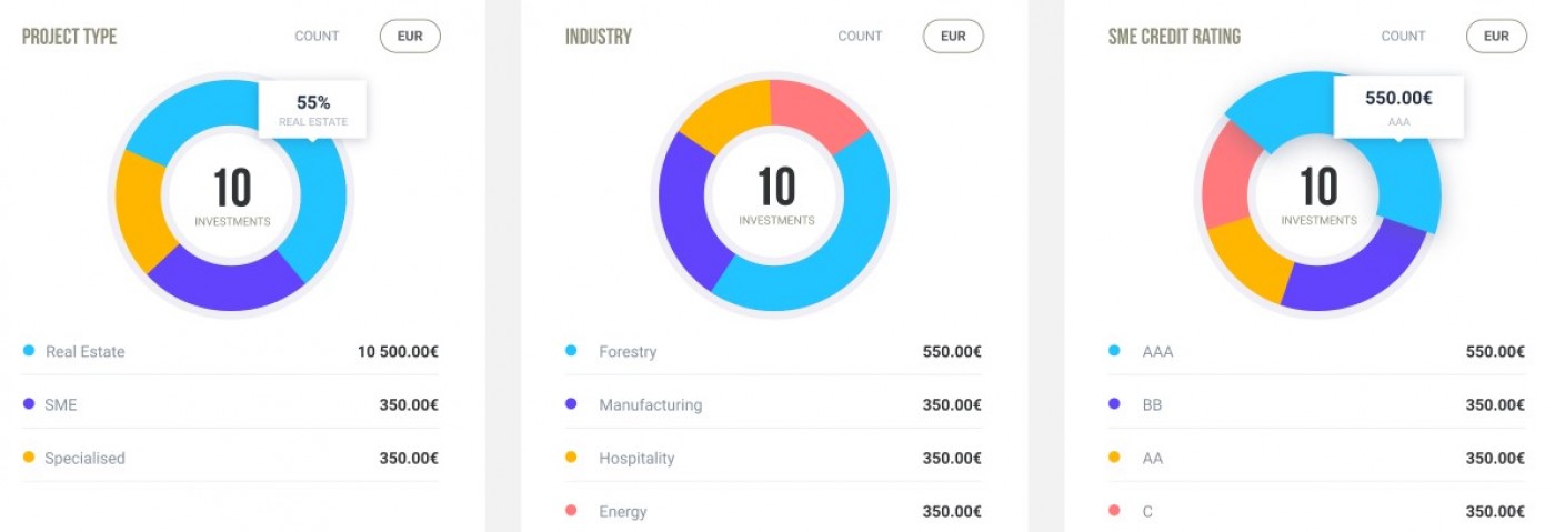
Allocation Pie Charts
When you press the “Account Balance” tab the dropdown pie charts appear. The three pie charts show the snapshot allocation of your portfolio- by project type, corresponding industry, or the SME credit rating (please note, the rating applies to all SME projects published after the 14th of August).
Actual Return
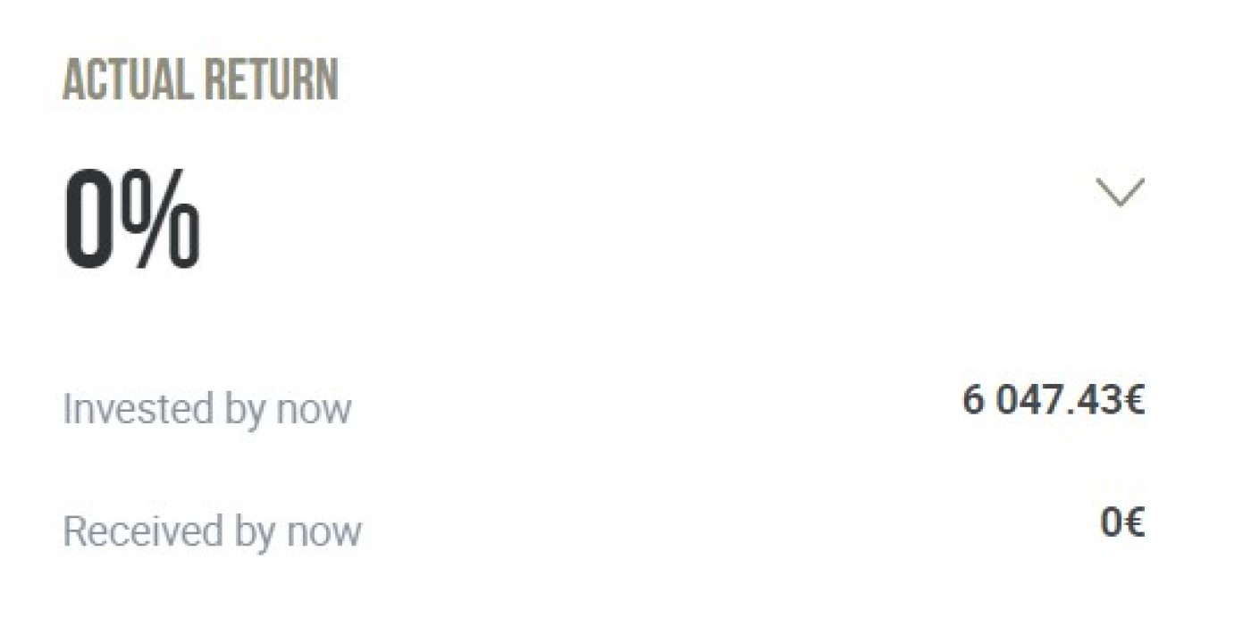
The Actual Return tab shows the interest rate that you have earned since being an investor at CROWDESTOR. Actual Return is a ratio of Received by now and Invested by now (shown below). Received by now is the interest rate you have earned on your investments and actually received referral income and Late Payment Fees.
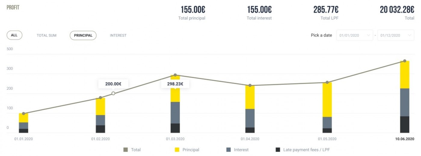
Profit Chart
When pressing the Actual Return tab, the Profit graph appears, where you can see all your monthly income in the last twelve months.
Active Investments
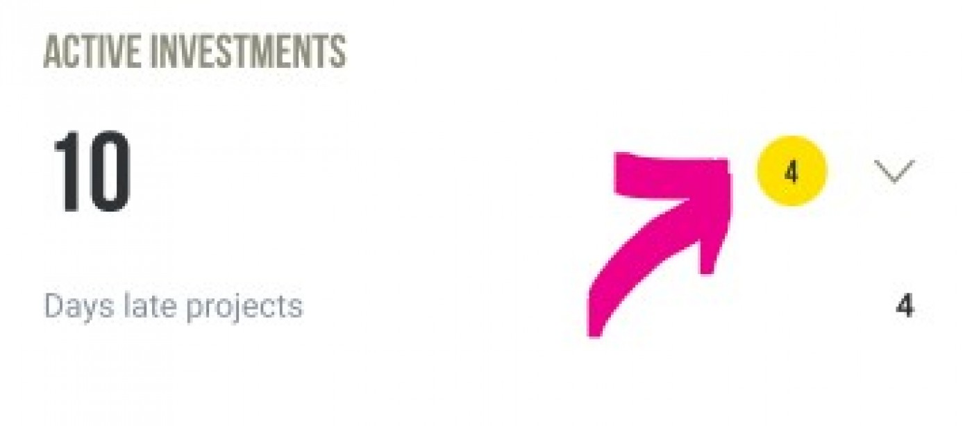
The Active Investments tab intuitively shows in how many projects you are invested right now. Below you see how many projects are experiencing delayed payments. The number highlighted in the yellow circle is the notifications that are available for the projects that are experiencing delays. These updates are aimed to be a centralized source of information for investors in the project with payment delays.
When pressing the Active Investments tab you can see more detailed information about the status of projects you are invested in. In the “My Investments” section you can switch between the projects depending on the status of their payments such as “current”, “0-30 Days Late”, “31-60 Days Late”, “61-90”, and “91+ Days Late”. The yellow notification signs appear next to the projects which have updates available. On the right-hand side, you can see the pie chart which breaks down the projects according to their payment status. You can also switch between pie charts showing the payment status of your active portfolio and the portfolio over time.
CROWDESTOR Team